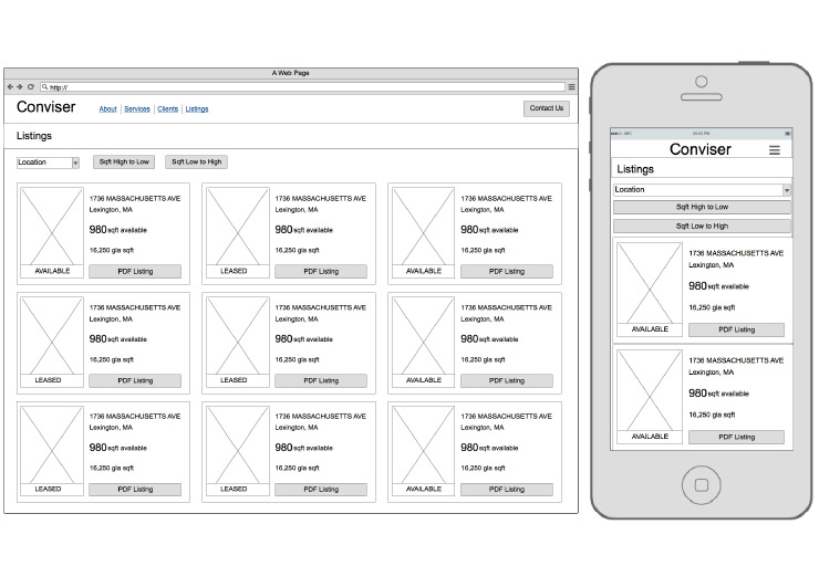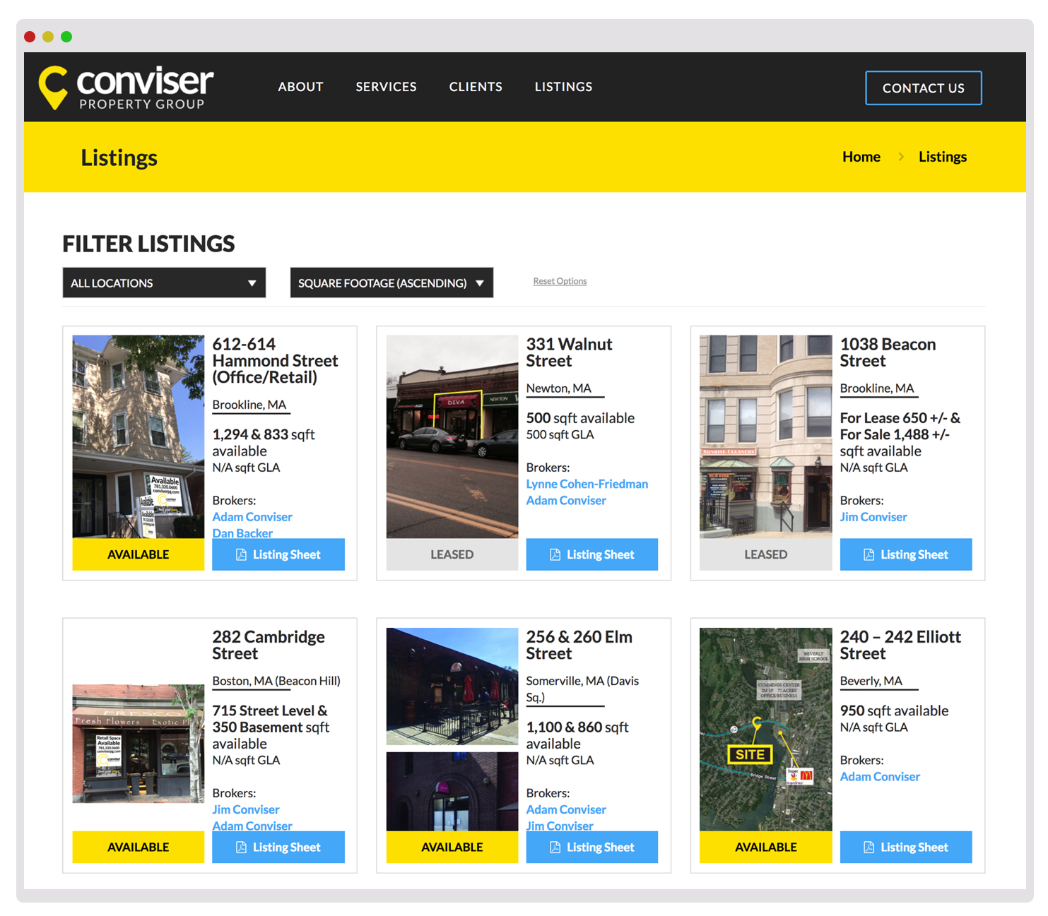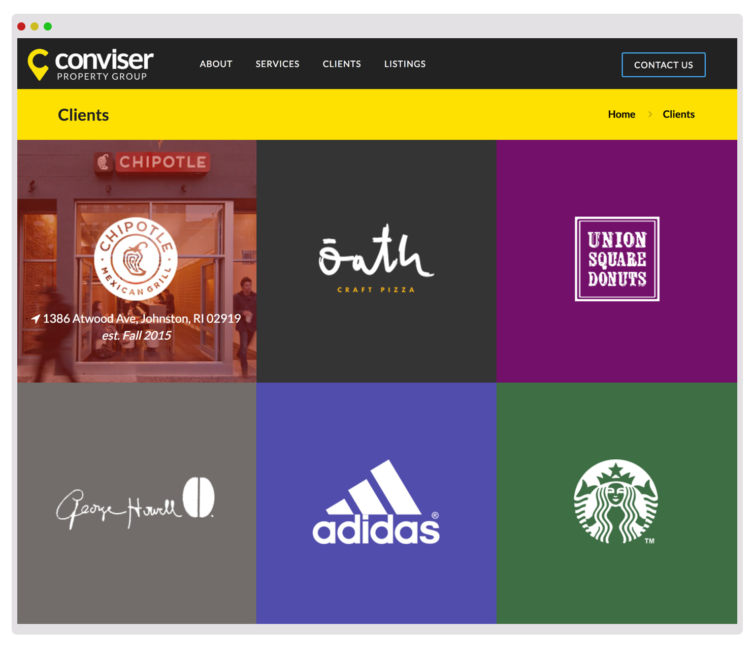
Brand & Website Redesign
Conviser prides itself on being one of Boston’s best “place-makers” for commercial real estate. Specializing in retail spaces for food and apparel, it is one of the region’s most successful brokerages. Conviser tasked ADK with a rebrand that would better reflect its prestige. I was tasked with designing the company’s new logo and managing the brand accoutrements for web and print.

For this brand redesign, I wanted to provide a welcoming and approachable application that was underscored by cleanliness and modernity. Through my iterative sketching of logotypes, I concluded that a waypoint-inspired letter “C” would be the perfect blend of their name and the placemaking that they do. Conviser requested that I incorporate the color yellow in the logo, which I emphasized with the sharp contrast of black. The end result was a clean and modern brand that emphasized their precision and professionalism.
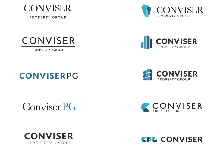 Early digital sketches
Once the logo was approved, I built out support print elements (business cards, letterheads and envelopes) along with a new website. I worked hard to bring the new brand colors to life through the website experience, taking advantage of the strong contrast to build out an energizing homepage and portfolio page. I even got to roll my sleeves up and dig into the site’s front-end code!
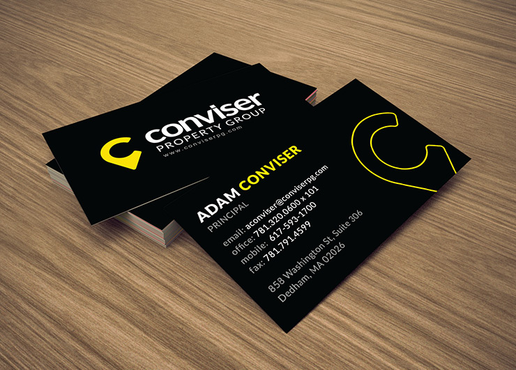
The end result was a rebrand that I am proud of, especially as I have heard how pleased CEO Adam Conviser is with it. It feels great to come across the logo in the wild, when I come across a building that is posted for lease.
