Redesigning Rhode Island Blood Center's Website
The Rhode Island Blood Center (RIBC), Rhode Island’s foremost provider of life-saving blood, needed to bring some life back into their web presence. In this project, I collaborated with digital strategists on my team and RIBC’s marketing director to refresh and deliver the site’s user experience and interface design.
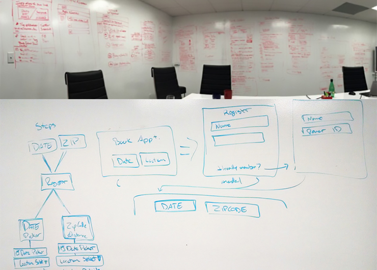
 Whiteboard wireframing sessions with RIBC
In our meetings with RIBC, we learned that despite being Rhode Island’s leading collector of blood donations, the website-driven donations and marketing were underwhelming. This was due, in part, to an outdated site that did not meet today’s best practices in content organization and device accessibility. We had a our work cut out. We first started with meeting the RIBC team and stakeholders from all departments and even donors. It was truly great to meet everyone as they left lasting impressions of empathy in the ADK team and myself, which proved very useful for later stages of the redesign.
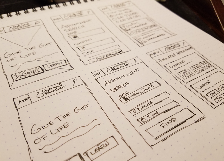
 Sketch sprint of donation sign up
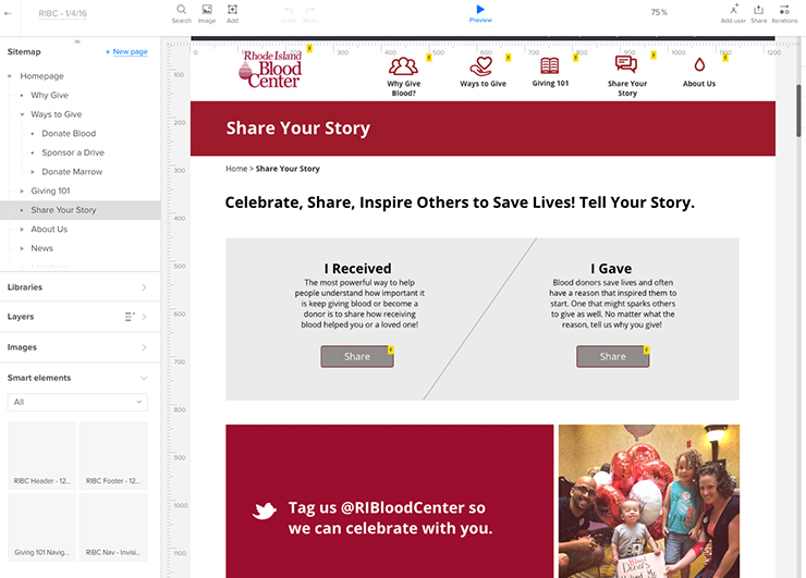
We engaged in long sessions of content-mapping and high-level wireframing to determine how to best lay out the new sitemap and user flow. Afterwards, plugged our notes into UXPin to help build a prototype/wireframe of the proposed approach. After finessing this through several iterations, it was time for high fidelity design.
 UXPin interactive mockup to facilitate design direction
I drew inspiration from the Digital Design Standards for the US Goverment in thinking of how to deliver a clean and usable interface for users of all ages and demographics to interact with. Our content mapping was categorized along two of RIBC’s central themes: Community and Accessibility. Community featured stories that support, engage, and highlight RIBC’s community of workers, donors, and donees. Accessibility facilitated awareness-building and donations with a clean, intuitive, informative, and responsive web platform.
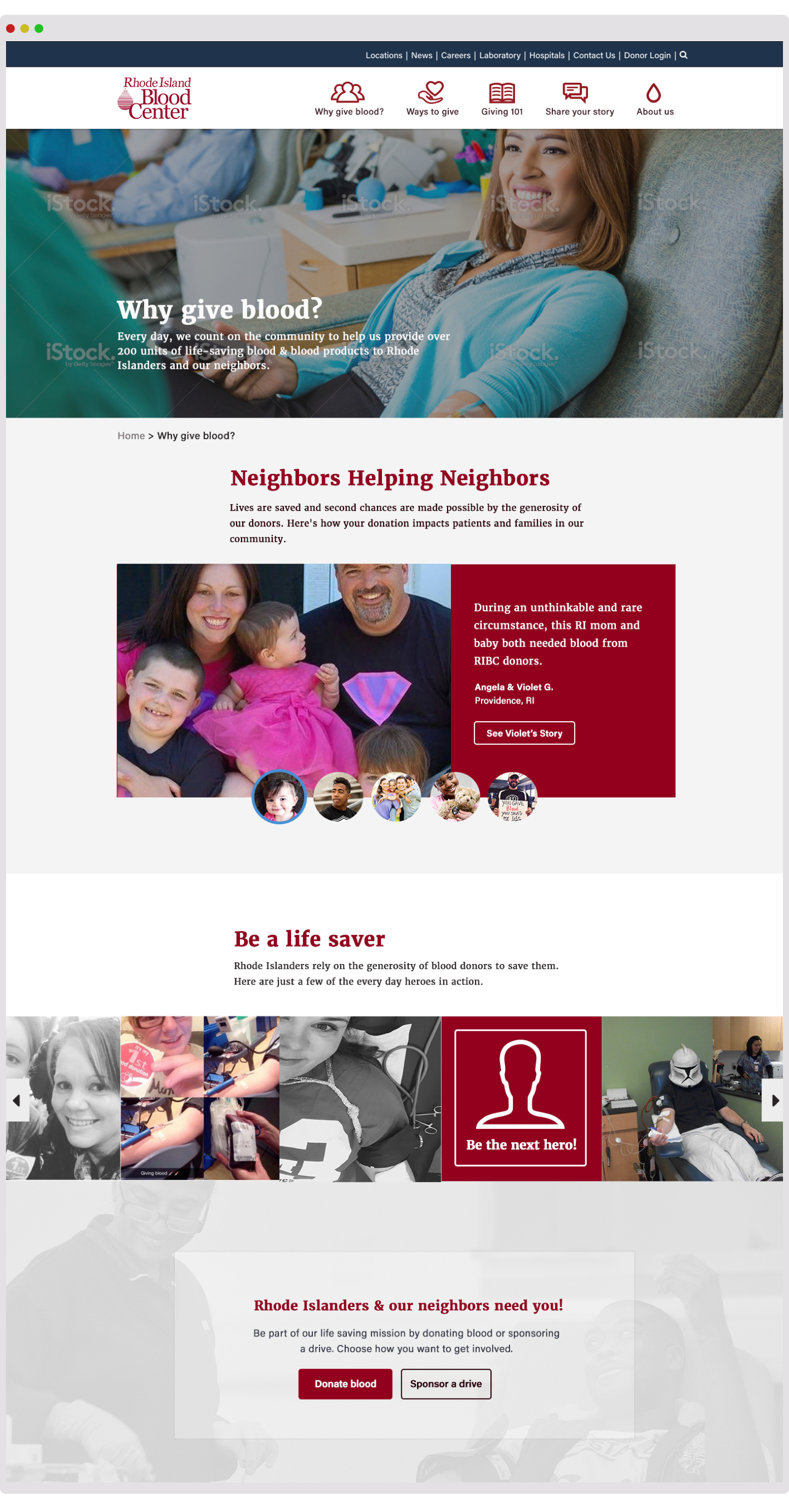
 Final visual design handed off to development using Zeplin
When the project went into development, I provided our developers a style guide to refer to as they built. The platform was built on Drupal 8, which at the time was the most recent release of the application.
Within the first few hours of the re-launch, appointments were already being made through the new in-site sign-up application. A few weeks later, mobile traffic had already increased by over 150%.